
Recent Work from the Studio
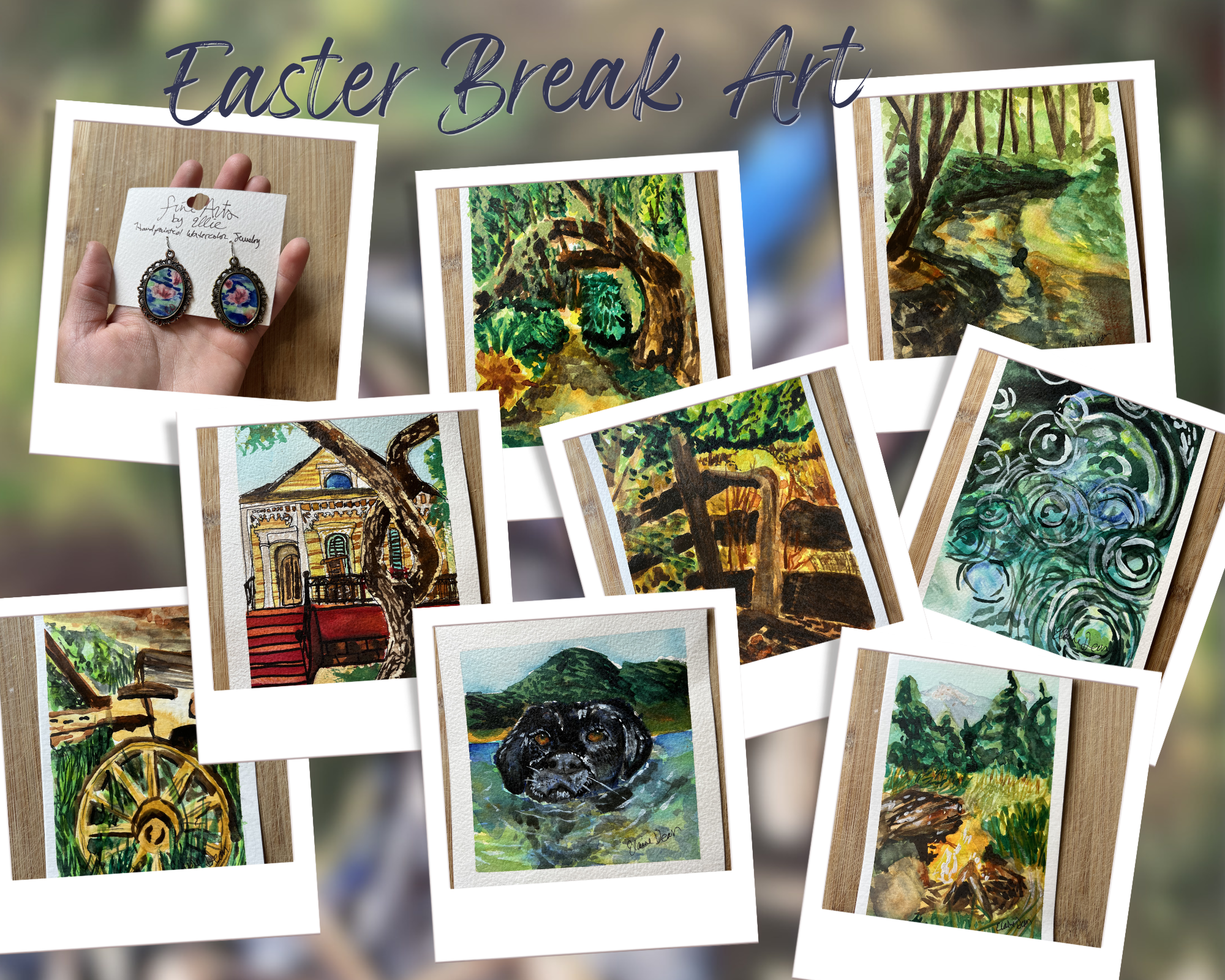
Easter Break Art
This past week shifted my focus toward smaller works, but not in a way that felt like scaling down—more like learning how to compress a full scene into something more immediate.
I also started experimenting with hand-painted watercolor jewelry. Working at that scale forced a different kind of decision-making. There’s no room to build slowly—you have to commit to shapes and color relationships almost immediately. The pieces ended up more abstract than my larger work, but they still carry the same palette and sense of movement, just reduced to something that can be worn instead of hung.
Most of the paintings from this week stayed rooted in observation, but each one pushed a slightly different problem.
“A Good Swimmer,” a 5×5 watercolor and gouache piece, became a study in restraint. The dog’s head sits just above the waterline, and most of the painting relies on controlling how the water distorts what’s beneath it. Instead of outlining everything, I had to let the darker washes suggest form while reserving the brightest highlights for the surface tension and ripples. The eyes ended up anchoring the entire piece—they’re the only place where everything resolves clearly.
“Old Cart,” a 4×6 watercolor, leans more on structure. The wheel and angled beams create a strong, almost graphic composition, but the challenge was keeping it from feeling flat. Because the palette stays fairly limited, the depth has to come from value shifts and directional brushwork rather than color variation.
“Hearth,” another 4×6 watercolor and gouache piece, is more about atmosphere. The fire itself is built quickly, but the surrounding space—the smoke, the ground, the way the light fades outward—required pulling pigment back out as much as putting it down. It’s one of the few pieces this week where lifting paint became just as important as applying it.
“Guardian of the Path,” at 6×8, focuses on framing. The arching tree creates a natural threshold, pulling the viewer inward toward the opening in the distance. The composition only works if that darker foreground stays heavy enough to contrast the light behind it, so most of the painting became about holding that balance without losing the sense of depth.
“A Little Creek” (6×8) moves differently. Instead of a single focal point, it’s built through layered shapes—rocks, water, and light overlapping. The painting relies on transparency more than contrast, letting earlier washes stay visible so the surface feels active rather than fully resolved.
“Solitude,” another 6×8 piece, pushes further into abstraction. The circular marks and overlapping washes don’t describe a literal scene as much as they suggest movement—like ripples or reflected light breaking apart. It’s one of the looser pieces from the week, but still grounded in the same color relationships as the rest.
“Old Yellow Home,” a 5×7 watercolor and gouache painting, shifts back toward structure. The house is partially obscured by the tree in the foreground, which became the main compositional decision. Instead of presenting the building clearly, the piece relies on that interruption—the branches cutting across the facade—to create interest and depth. The ink lines reinforce the architecture without over-defining it.
“Old Fence,” another small study, simplifies even further. The vertical posts and angled lines break up the space, but the painting is less about detail and more about how those shapes sit against the light. It’s one of the more reduced pieces, but still carries the same attention to contrast.
Looking across everything from the week, there’s a consistent pull toward subjects that feel weathered or partially reclaimed—structures, paths, and objects that exist in tension with their surroundings. At the same time, there’s a shift in how I approached watercolor itself. Instead of building everything gradually, I started committing to darker values earlier and letting the painting resolve around those decisions.
These pieces sit somewhere between studies and finished work, but they’re not placeholders. They’re part of a larger direction that’s becoming more defined—focused on compression, clarity, and letting fewer marks carry more weight.
